
In the world of patch design, the concept goes beyond a pretty image stitched on fabric; it’s a tiny, portable brand message that communicates identity, values, and style at a single glance. When designed with intention, patches become memorable insignia that fans collect, wear, and trade, so think about how your custom patches tell a story. The goal of patch design isn’t just to look good; it’s to balance aesthetics with manufacturability, durability, and brand storytelling. In this guide, you’ll learn how to design patches that are visually striking, easy to produce, and perfectly aligned with your message. From choosing the right size and shape to selecting embroidery techniques, you’ll build patches that stay vibrant and durable while conveying your identity.
Viewed through an alternative lens, this craft becomes emblem creation, badge branding, or stitched insignia that communicates identity through textile art. Think in terms of symbols and motifs that can be embroidered on fabric, turning clothing and accessories into portable branding. A well-conceived patch emblematizes a team, club, or brand with scalable vector art and clear silhouettes so it remains legible when resized. By framing the project as badge design or branding patches, you tap into related strategies such as color harmony, edge finishing, and durable backing. Ultimately, the same idea – storytelling through wearable art – can be achieved with simple shapes, bold contrasts, and thoughtful production choices.
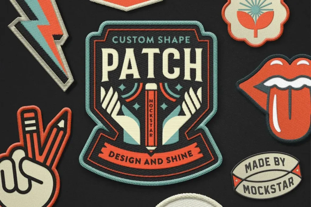
Patch Design Fundamentals: From Concept to Vector Artwork
Design starts with a clear concept translated into scalable vector art. When you know the core message you want to convey, you can outline shapes, typography, and color blocks that will translate cleanly to embroidery. This is where the idea of custom patches begins to take shape, because the right concept scales from a small badge to a larger collection without losing impact. If you’re wondering how to design patches, think in terms of simple silhouettes, bold outlines, and a limited color palette that stays legible at stitch density.
The practical path combines aesthetics with production realities: choose a sensible size, decide on a shape that communicates your concept, and prepare your artwork with clean vectors and a safe die line margin. Embroidery density matters—too sparse and the patch looks unfinished; too dense and the stitching weighs down the fabric. By planning stitch counts early, you set the stage for patches that look crisp, wear well, and align with your brand narrative.
Patch Design Ideas: Creative Concepts That Stand Out
Great patches begin with ideas that resonate with your audience. This is where patch design ideas come to life, from mascot emblems to typographic badges, and tiny scenes that hint at a larger story. Sketch a few concepts and select the one that achieves the right balance of simplicity and impact. Testing several strong ideas beats iterating on a crowded, over-detailed concept.
Mood boards help you explore color palettes, typography, and motifs, guiding decisions on edge style and detail level based on who will wear the patch and where it will be applied. For stand out patches, craft a narrative via the patch’s visual elements—each symbol or letter should reinforce the overall message rather than compete for attention.
Color Theory and Visual Hierarchy for Patches
Color is a powerful storyteller in patch design. Limit the palette to 3–5 colors to keep embroidery crisp and production manageable, while high-contrast combinations help the patch pop from a distance. The visual hierarchy should place the main symbol in dominant colors, with outlines or internal details in secondary tones, and a neutral for negative space. This approach supports clear readability at small sizes and aligns with the idea of patch embroidery design that remains durable in real-world wear.
Consider thread blends for subtle shading, but avoid complex gradients that can complicate stitching. A strong hierarchy ensures the primary icon reads clearly even when scaled down. When assigning colors, think about brand alignment and how the palette translates across different materials, lighting, and backgrounds so your patches stay recognizable under various conditions.
Production-Ready Techniques to Elevate Patch Design
There are concrete techniques to elevate patch design without sacrificing durability. Satin stitches along the edges create crisp definition, while fill stitches provide solid color fields. For texture and dimension, combine stitch types carefully and avoid tiny details that won’t translate at small sizes. The merrow border offers a polished, durable finish that helps patches hold their shape over time—a small detail with big impact for stand out patches.
Backing options affect longevity as well. Iron-on backs are convenient, but sew-on or Velcro backs deliver greater endurance in heavy-wear environments. Choose backing based on use case, and consider finishes like matte versus metallic threads. Finishes influence how the colors read in different lighting and can elevate a patch from a simple emblem to a collectible element.
Sizing, Shapes, and Placement: Practical Guidelines
Size and shape drive production costs and wearability. Common sizes range from 1.5 to 3 inches, with larger patches reserved for statement pieces. Shield, circular, and rectangular shapes cover most branding needs, while die-cut shapes can be memorable if the artwork remains legible at small scales. Think about placement—collars and hats benefit from smaller, legible icons, while jackets and bags can accommodate more detail.
When designing for placement, anticipate the garment’s movement and lighting. Edge finishes, legibility, and color contrast must stay effective across fabrics and textures. By aligning edge style with the intended wear, you create patches that not only look good but also perform well under real-world conditions.
From Concept to Patch: A Step-by-Step Workflow for Custom Patches
A clear workflow helps you translate a concept into a production-ready patch. Begin by defining the message and audience to guide the design direction, then create clean vector art and a defined dieline. This approach is essential for custom patches, where consistency across a line matters for brand recognition. If you’re asking how to design patches, this step-by-step process keeps you focused on scalable, repeatable results.
Next, develop a detailed spec sheet: backing type, edge finish, and a color map that matches your thread palette. Validate legibility at real-world sizes, and request a physical thread sample from manufacturers before mass production. The final steps—proofing, approval, and mass production—are where production-ready files and precise specs translate your concept into durable, high-quality patches.
Frequently Asked Questions
What are the essential steps in patch design to create standout custom patches?
To design standout patch embroidery, start by defining the core message for your custom patches, then sketch multiple patch design ideas and pick the strongest concept. Create clean vector art with clear outlines and a safe die line margin. Develop the dieline, set stitch density, choose backing and edge finish (merrow border), and test legibility at small sizes. Share specs with the manufacturer and iterate as needed to ensure durability and brand storytelling.
How do I choose the right size, shape, and backing for patch embroidery design?
Consider practical size and shape—1.5–3 inches for apparel; circular, shield, rectangular are common; custom die-cut shapes can convey a unique identity. Choose edge finish like merrow border and backing (iron-on, sew-on, Velcro) based on wear and user. Ensure legibility by tweaking stitch density and simplifying details.
What role does color theory play in patch design ideas to make stand out patches?
Use a 3–5 color palette for clean embroidery; assign dominant color for main symbol, secondary color for outlines/details, and neutral for background. High-contrast combos help visibility from a distance; color grading with thread blends can add depth but durability matters. Align colors with brand guidelines to reinforce recognition.
How do I convert an image to patch design for production?
Start with vector-based art; convert raster to clean vectors, define outlines, set safe margins and dieline. Provide a color map with Pantone references; specify size range; request a physical thread sample from manufacturer before mass production.
What is a practical workflow from concept to production for custom patches?
From concept to patch: define message and audience; create vector art; develop dieline and stitch plan; choose backing and edge finish; test legibility at real sizes; send to manufacturer for proof; finalize and mass-produce with clear specs.
What common mistakes should I avoid in patch design to ensure durability and legibility?
Avoid too much detail at small sizes; ensure sufficient color contrast; keep branding consistent across the line; choose backing appropriate for intended wear; design with stitch counts and edge finishes in mind to prevent revisions.
| Aspect | Key Points |
|---|---|
| Introduction | Patch design is more than decoration; it’s a portable brand message that communicates identity, values, and style at a glance. |
| Patch Design Basics | Core levers: size, shape, artwork, embroidery density. Start with a practical size and clear concept; choose a shape that communicates your idea; use vector-based art; define a safe die line margin; plan stitch counts for crisp colors and durability. |
| From Concept to Sketch | Great patches start with a resonant idea. Outline the core message, sketch several concepts, pick the strongest, use mood boards for color palettes and motifs, and consider wearers to guide color choices and edge detail. |
| Color Theory & Visual Hierarchy | Limit palette to 3–5 colors; high contrast aids legibility; assign a dominant color to the primary symbol, a secondary color to outlines/details, and a neutral for background; maintain visual hierarchy; subtle shading can be durable with thread blends. |
| Techniques that Make Patches Stand Out | Embroidery style (satin for edges, fill for fields); detailing with split stitches or thread shading; merrow borders for durability; backing options (iron-on, sew-on, Velcro); finishes (matte vs metallic). |
| Materials & Production | Fabrics like twill, felt, and camouflage; polyester vs rayon threads; backing and patch thickness; heavier patches feel premium but cost more. |
| Designing for Production | Clean vector art, a clearly defined dieline, size range, backing, edge finish, and color references; safe margins; color maps; request physical thread samples; precise specs save time. |
| Creative Concepts | Symbol-first, Typographic patches, Story-driven scenes, Thematic collages, Minimalist marks — each approach yields a distinct visual voice. |
| Sizing, Shapes & Placement | Common sizes 1.5–3 inches; shield, circular, rectangular shapes; custom die-cut shapes; placement affects legibility and detail tolerance. |
| Workflow | Define message and audience; create vector art; develop the dieline; choose backing/finish; test legibility; obtain manufacturer sample; mass-produce with clear specs. |
| Common Mistakes | Too much detail at small sizes; poor color contrast; inconsistent branding; underestimating backing needs; ignoring production limits. |
| Why Patch Design Matters | Patch design blends art and production science; strong concepts, color theory, appropriate techniques, and precise specs yield durable patches that become part of a brand vocabulary. |
Summary
Conclusion: Patch design is a field where creativity meets practicality. By focusing on clear messaging, scalable vector artwork, durable embroidery techniques, and production-ready specs, you can craft patches that stand out in any crowd. Remember to test early, iterate often, and keep your audience in mind at every step. With the right approach, your patches won’t just clothe fabric — they’ll tell stories, reinforce branding, and become coveted collectibles for years to come.